Your Brain’s Visual Superpowers: Why That Red Dot Grabs Your Attention EVERY. SINGLE. TIME.
May 1, 2025 in Industry Insights, Innovative Capabilities, Technology & Tools
By Jonathan Horowitz
Ever notice how your brain instantly spots the red dot in a sea of blue ones? That’s preattentive processing at work! It’s how our brains automatically process visual stuff like colors, shapes, and sizes in a split second—we’re talking less than 250 milliseconds—before we even consciously think about it.
This quick-processing superpower evolved because our ancestors needed to spot dangers (or dinner) fast. Your visual system doesn’t waste time analyzing everything one by one—it takes in multiple visual elements all at once, which is why psychologists call it “parallel processing.”
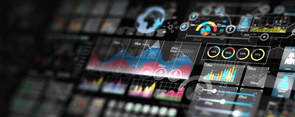
This automatic brain function is gold for making great data visualizations. Smart designers use these preattentive attributes strategically to guide your eyes to the important stuff first. For example, think about a dashboard where critical KPIs are in red while everything else is blue—you’ll spot the problems instantly. Or consider how a scatter plot uses both position and color to help you identify outliers without any effort. These visual tricks create a natural hierarchy that tells the data’s story more clearly.
As visualization expert Colin Ware points out, “it is easy to spot a single hawk in a sky full of pigeons, but if the sky contains a greater variety of birds, the hawk will be more difficult to see.” This perfectly captures why limiting the number of visual variations in our displays makes important information stand out more effectively.
Speaking of visual organization, this is where Gestalt principles come into play too. Your brain naturally groups similar elements together (similarity), perceives complete shapes even when parts are missing (closure), and assumes objects near each other are related (proximity). You can see these principles in action when looking at a stacked bar chart—you naturally group the same-colored segments across different bars (similarity), or when viewing a line chart with a gap in data, your mind automatically “completes” the missing line segment (closure).
Using these visual shortcuts is super important because our brains have limited processing power. Well-designed visualizations that tap into preattentive processing reduce mental effort—meaning you spend less energy figuring out what you’re looking at and more energy understanding what it means. Think about how much easier it is to spot trends in a heat map where intensity of color shows value, compared to scanning rows of numbers in a table. Or how much faster you can identify the highest performer when bars in a chart are sorted by height. This is especially helpful with complex data, where quickly spotting patterns or outliers can make all the difference in how fast and accurately you interpret information.
So next time you’re checking out a well-designed chart or infographic and instantly “get it,” thank your brain’s incredible visual processing system—it figured out what you were looking at before you even realized you were looking! That’s right, your brain had already processed the main message while you were still thinking about whether to have another coffee. Talk about efficiency!

Jonathan Horowitz is a Managing Consultant with a focus on data modeling, data architecture, data transformation, and data visualization. He lives in Chicago with his husband and their 3-year-old lab, Cooper. For fun, he enjoys trying new restaurants around the city, gardening, playing urban planning video games, and making valiant attempts at cooking.